English
 Deutsch
 Español
 Português
 Italiano
 Français
 Manchester United
 Man City
 Tottenham Hotspur
 Aston Villa
 Newcastle United
 Fulham
 Everton
 West Ham United
 Leeds United
 Ipswich Town
 Nottingham Forest
 Crystal Palace
 Brighton
 Wolves
 Atletico Madrid
 Real Betis
 Real Sociedad
 Villarreal
 Napoli
 Roma
 Lazio
 Venezia FC
 Bayer Leverkusen
 RB Leipzig
 Eintracht Frankfurt
 Borussia Dortmund
 AS Monaco
 Olympique Lyonnais
 Marseille
 Chivas
 Tigres UANL
 Monterrey
 Club America
 Cruz Azul
 Pumas UNAM
 Club León
 Ajax
 Sporting
 Boca Juniors
 PSV
 Olympiacos
 FC Porto
 Glasgow Rangers
 New York City
 LA Galaxy
 Orlando City
 Bologna FC
 New York Red Bulls
 Scotland
 Norway
 Austria
 Czech
 Albania
 Sweden
 Greece
 Ireland
 Turkey
 Yugoslavia
 Hungary
 Ecuador
 Venezuela
 Uruguay
 Chile
 Peru
 Japan
 Australia
 Saudi Arabia
 Senegal
 Cameroon
 Morocco
 Nigeria
 Algeria
 Egypt
 Jamaica
 Guatemala
 Panama
 El Salvador
 Real Madrid
 Barcelona
 Fiorentina
 Celtic

Last updated: 31 October, 2026
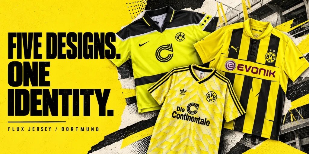
Our pick of the best Dortmund kits starts with the 1996/97 European design: its fluorescent yellow, broad black shoulder panel and polo collar give it the strongest visual identity in this selection. For a different approach, choose the striped 2012/13 European design, the patterned 1988 retro look, the bold 2025/26 home shirt or the quieter pattern of the 2026/27 home shirt.
These five are an editorial selection reviewed on 24 October 2026, chosen for graphic character, contrast and documented context. The order reflects our design preferences. All photographs show current Flux Jersey catalogue items, not original match-worn shirts. The official sources below explain club history and design themes; they do not establish the manufacture or provenance of the pictured items.
1. The 1996/97 European design: our standout

The black panel across the shoulders gives this shirt a frame. Its pale outline separates it from the bright yellow body, while the collar and sleeve stars add detail above and beside the large central sponsor. The result has several distinct elements without relying on an all-over pattern.
That is why it leads our selection: the silhouette remains recognisable before you inspect the smaller details. Its European association also has a clear historical anchor. Dortmund beat Juventus 3–1 in the 1997 Champions League final, as recorded by UEFA’s match record.
The trade-off: the fluorescent colour and several bands compete for attention. If you prefer a simpler yellow field, the later home designs below are easier choices.
2. The 2012/13 European design: the striped alternative

Broad vertical black stripes make this the clearest alternative to the horizontal structure of our first pick. The yellow panel behind the magenta sponsor interrupts those stripes across the chest. A small polo collar adds another change of direction, so the upper half feels more structured than a plain round-neck shirt.
We chose it for that strong stripe pattern and its association with another European final campaign. Dortmund reached the 2013 Champions League final at Wembley, losing 2–1 to Bayern; UEFA’s retrospective provides the match context.
The trade-off: the sponsor panel breaks the rhythm of the stripes. This is also a reason to compare photographs carefully: a season can have different domestic, European and special shirts. A year alone does not identify the design.
3. The 1988 retro look: pattern over contrast
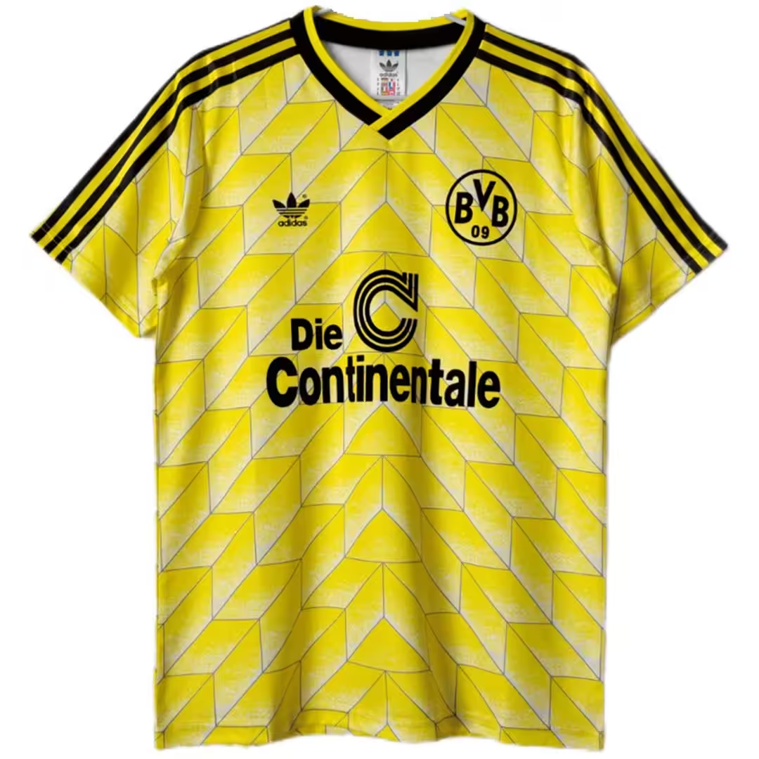
This is our choice for readers who enjoy detail across the fabric rather than one large contrasting panel. Pale diagonal shapes repeat over the yellow body. Black shoulder stripes and a dark V-neck contain that pattern, with the sponsor sitting directly on the patterned field.
Its appeal comes from the combination: the shoulders and neckline are easy to read, while the body becomes more intricate at close range. We retain the catalogue’s 1988 label here; we are not identifying this photographed item as a shirt worn in a particular cup final.
The trade-off: the tonal pattern is less conspicuous at a distance than the black stripes of the 2012/13 selection. Choose it for the texture of the design, rather than the strongest black-and-yellow contrast.
4. The 2025/26 home design: impact high on the chest

The black upper section and jagged yellow graphics concentrate the energy around the chest and sleeves. Below that, the larger yellow field gives the design room to settle. It offers a different balance from both the full-length stripes and the repeating geometric pattern above.
In its 8 August 2025 launch announcement, PUMA described a yellow base with distorted black graphics across the chest.
The trade-off: the irregular upper graphic is deliberately busy. We prefer it when the neckline and shoulders are the main attraction; it is less suitable if you want an even pattern across the whole shirt.
5. The 2026/27 home design: detail in the yellow field

Here, the interest sits within the yellow field. A tonal architectural pattern runs across the body, while pale collar and cuff trim give the edges a lighter finish. Compared with the 2025/26 design, the contrast is less concentrated in a large black chest section.
PUMA’s 8 May 2026 design announcement connects the shirt to Dortmund’s industrial architecture, including Minister Stein and the Dortmunder U. We selected it because that documented local reference adds something to the visual comparison.
The trade-off: the tonal pattern needs a closer look. If you want an immediate, high-contrast impression, our first two picks do that more clearly.
Which are the best Dortmund kits of all time?
Our choice remains the 1996/97 European design, but an all-time favourite depends on which feature matters most to you. If you are comparing the best Dortmund jerseys for your own collection, first decide whether you want a strong outline, bold stripes or a quieter all-over pattern. The photographs make those differences easier to judge than the year labels alone.
Then check the details that could change your choice. Does the sponsor interrupt a pattern you otherwise like? Is the collar part of the appeal? Would you prefer the same contrast across the whole shirt or concentrated around the shoulders? Compare the exact season and competition version in the photograph before settling on a design.
Once you have chosen the design, our blank or named soccer jersey guide helps you decide whether a player print belongs on the back.