English
 Deutsch
 Español
 Português
 Italiano
 Français

 Manchester United
 Man City
 Tottenham Hotspur
 Aston Villa
 Newcastle United
 Fulham
 Everton
 West Ham United
 Leeds United
 Ipswich Town
 Nottingham Forest
 Crystal Palace
 Brighton
 Wolves
 Atletico Madrid
 Real Betis
 Real Sociedad
 Villarreal
 Napoli
 Roma
 Lazio
 Venezia FC
 Bayer Leverkusen
 RB Leipzig
 Eintracht Frankfurt
 Borussia Dortmund
 AS Monaco
 Olympique Lyonnais
 Marseille
 Chivas
 Tigres UANL
 Monterrey
 Club America
 Cruz Azul
 Pumas UNAM
 Club León
 Ajax
 Sporting
 Boca Juniors
 PSV
 Olympiacos
 FC Porto
 Glasgow Rangers
 New York City
 LA Galaxy
 Orlando City
 Bologna FC
 New York Red Bulls
 Scotland
 Norway
 Austria
 Czech
 Albania
 Sweden
 Greece
 Ireland
 Turkey
 Yugoslavia
 Hungary
 Ecuador
 Venezuela
 Uruguay
 Chile
 Peru
 Japan
 Australia
 Saudi Arabia
 Senegal
 Cameroon
 Morocco
 Nigeria
 Algeria
 Egypt
 Jamaica
 Guatemala
 Panama
 El Salvador
 Real Madrid
 Barcelona
 Fiorentina
 Celtic

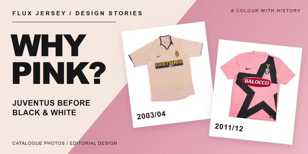
Juventus wear pink as a reminder of the club’s earliest colours. Before the familiar black-and-white stripes, the team played in pink: Juventus’ own history records a pink shirt at its national championship debut in 1900. Later pink designs revisit that connection, with very different collars, graphics and sponsors.
Before black and white: pink and the 1903 change
Pink predates the striped identity. The club’s history places the switch to colours from Nottingham three years after that 1900 debut. Its dated account of Tom Gordon Savage is more explicit: in 1903, he brought Notts County’s black and white to Turin.
That makes pink a reference to Juventus’ origins, even when the shirt itself looks modern. A returning colour does not mean a design is a literal reconstruction of an early garment. The following examples trace changes in the front design, rather than every return of pink.
Two pink shirts, two different designs
These are current Flux Jersey catalogue photographs of retro designs, not photographs of surviving match-worn shirts. Start with the whole front, then compare the neckline and the largest graphic.
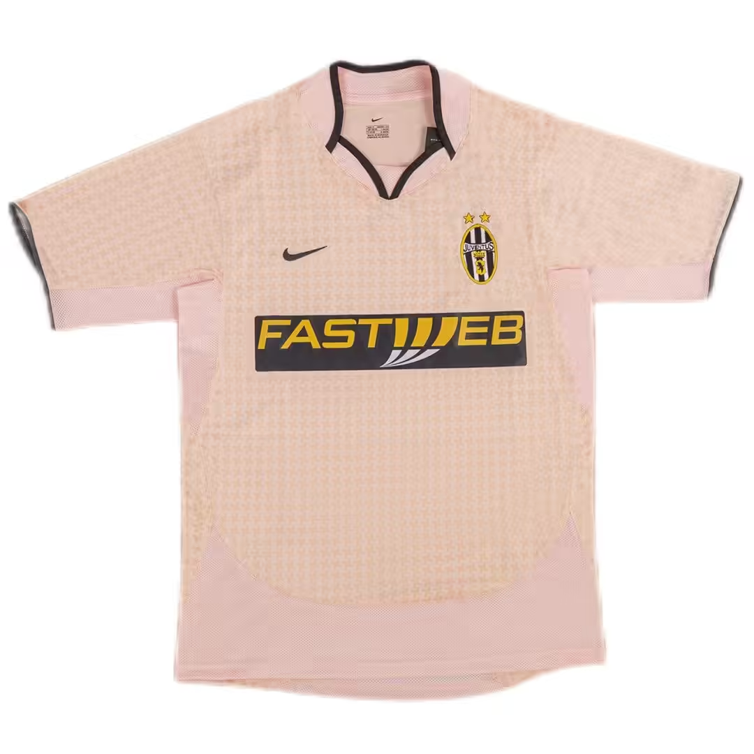
Our 2003/04 away reference has a pale pink body, a black-edged open collar and yellow FASTWEB lettering on a dark rectangular panel. The fine pattern across the torso leaves the sponsor as the strongest central contrast. Qoly’s retrospective on pink football shirts also identifies Juventus’ 2003/04 away design as pale pink.
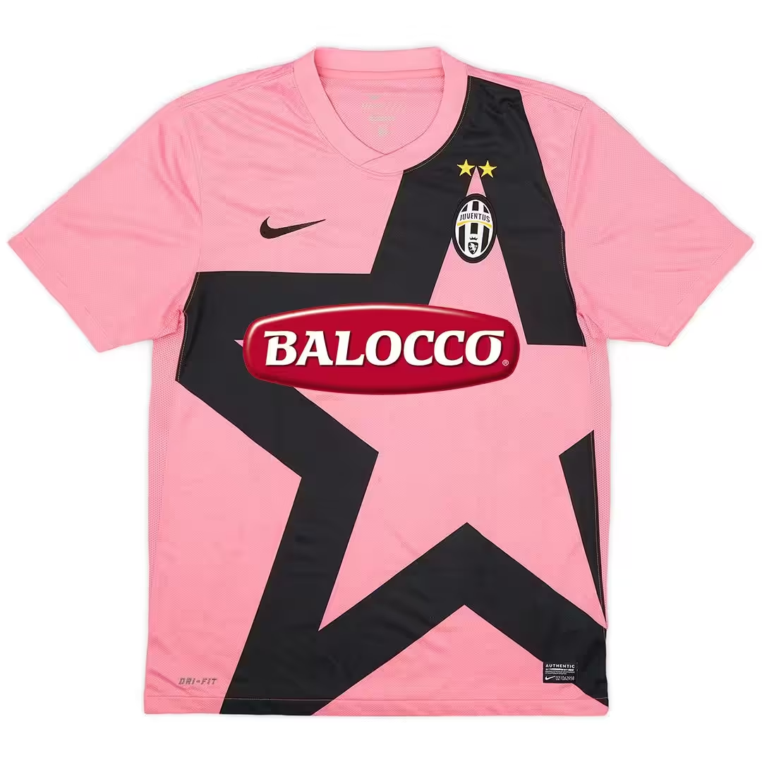
The 2011/12 reference changes that balance. Its pink neckline blends into a brighter pink body, while an enormous black star spreads across the front behind the red BALOCCO sponsor. The star continues well below the lettering, so it dominates the silhouette rather than sitting as a small chest emblem. SoccerBible’s photographed 2011/12 shirt feature documents this oversized-star design.
Colour alone is therefore a weak way to identify a pink Juventus shirt. In these two photographs, the open black-edged collar and FASTWEB panel distinguish one design; the pink neck, large star and BALOCCO oval distinguish the other. Lighting can affect the apparent shade, but those layout differences remain visible.
The 2015/16 return changed the layout again
For another documented approach, look at the club’s adidas launch dated 1 July 2015. The away design paired pale pink with brighter pink sleeve accents and a chest panel using white stripes. A black round neck and black adidas stripes framed the shirt.
Instead of the large 2011/12 star, this design used horizontal bands as its central feature. The launch explicitly connected pink to the club’s early years. It is a useful final distinction: the historical reference can stay the same while the graphic changes completely.
When comparing a shirt with a dated reference, check the collar, front graphic and sponsor together. Those details help place the design; they do not establish when an individual garment was manufactured or whether it was worn by a player.